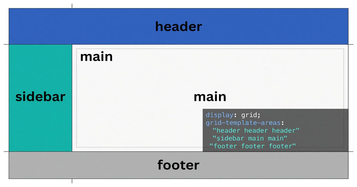
grid-template-areas is one of the most readable things in CSS. Instead of describing a layout through numeric column and row coordinates, you draw it — using a string of names that mirrors the visual arrangement you want. A two-column dashboard with a header and footer looks, in the CSS, like a two-column dashboard with a header and footer.
This article covers the syntax in full, explains how named areas interact with the rest of the Grid model, and works through the patterns practitioners reach for most often.
What grid-template-areas Does
When you define a grid, the tracks exist but the regions are anonymous. Items get placed into them automatically, or you assign them manually with grid-column and grid-row. That coordinate-based approach works, but the intent is buried in numbers.
grid-template-areas gives regions names. You declare those names on the container, assign each grid item to one name with grid-area, and the browser handles placement. The layout becomes readable from the CSS alone.
.page {
  display: grid;
  grid-template-columns: 240px 1fr;
  grid-template-rows: 60px 1fr 48px;
  grid-template-areas:
    "header  header"
    "sidebar main"
    "footer  footer";
}

.page-header  { grid-area: header; }
.page-sidebar { grid-area: sidebar; }
.page-main    { grid-area: main; }
.page-footer  { grid-area: footer; }
The three quoted strings represent three rows. Each word within a string represents a column cell in that row. Repeat a name across adjacent cells and that item spans them.
Syntax Rules
Quoted strings, one per row
Each row is a separate quoted string. The number of words in each string must match — if you have three columns, every row string must have three entries. A mismatch is a parse error; the browser discards the entire property.
/* Valid — 3 columns, 3 rows */
grid-template-areas:
  "nav   nav    nav"
  "aside main   main"
  "aside footer footer";

/* Invalid — row 2 has 2 words, row 1 has 3 */
grid-template-areas:
  "nav nav nav"
  "aside main";
The dot for empty cells
Use a period (.) to mark a cell that belongs to no named area. Multiple consecutive periods (with or without spaces between them) represent a single empty cell — ... and . . . are equivalent.
grid-template-areas:
  "logo  .      nav"
  "hero  hero   hero"
  "main  main   sidebar";
The top center cell is empty — no grid item will be placed there through grid-area, though auto-placed items can still flow into it if grid-auto-flow allows it.
Names must form rectangles
Each named region must be a contiguous rectangle. L-shapes, T-shapes, and non-contiguous uses of the same name are invalid.
/* Invalid — "main" is not a rectangle */
grid-template-areas:
  "header header"
  "main   aside"
  "main   footer";
The browser will reject the declaration. If you need an irregular visual arrangement, use grid-column and grid-row for that specific item rather than template areas.
Custom identifier rules
Area names follow the same rules as CSS custom identifiers. They are case-sensitive, cannot start with a number, and cannot be a CSS keyword. main, sidebar, header, footer, content, nav are all fine. 2col-left is not valid (starts with a digit).
How Named Areas Interact with Track Sizing
grid-template-areas defines placement but not sizing. The track sizes come from grid-template-columns and grid-template-rows, or from grid-template shorthand. Named areas occupy whichever cells they’re assigned to — the sizing of those cells is entirely separate.
.layout {
  display: grid;
  grid-template-columns: minmax(200px, 25%) 1fr;
  grid-template-rows: auto 1fr auto;
  grid-template-areas:
    "header header"
    "nav    content"
    "footer footer";
}
The header and footer span both columns because their name appears in both column cells of their row. The 1fr column and the minmax(200px, 25%) column size independently — the area assignment doesn’t influence that.
grid-template shorthand
The grid-template shorthand combines all three:
.layout {
  display: grid;
  grid-template:
    "header header" 60px
    "nav    content" 1fr
    "footer footer" 48px
    / 240px 1fr;
}
Each quoted string can be followed by a row size. The slash at the end separates the row definition from column sizes. This is compact but denser to read — whether it improves or harms clarity depends on the complexity of the layout.
Spanning with Named Areas
Spanning in grid-template-areas is structural, not declarative. A name spans multiple columns or rows simply by appearing in multiple adjacent cells in the template.
grid-template-areas:
  "hero   hero   hero"
  "card1  card2  card3"
  "footer footer footer";
hero spans all three columns because it appears three times in the first row. footer spans all three columns in the third row. The three card areas each occupy one cell.
This is distinct from grid-column: 1 / 4 on an individual item. Template areas span is structural — it shapes the entire layout map simultaneously, not item by item.
Responsive Restructuring
The most practical reason to use template areas over coordinate placement is how cleanly layouts restructure at breakpoints. You redefine the string map; the items follow.
.page {
  display: grid;
  grid-template-columns: 1fr;
  grid-template-rows: auto;
  grid-template-areas:
    "header"
    "nav"
    "main"
    "aside"
    "footer";
}

@media (min-width: 768px) {
  .page {
    grid-template-columns: 200px 1fr;
    grid-template-areas:
      "header header"
      "nav    main"
      "nav    aside"
      "footer footer";
  }
}

@media (min-width: 1200px) {
  .page {
    grid-template-columns: 200px 1fr 280px;
    grid-template-areas:
      "header  header  header"
      "nav     main    aside"
      "footer  footer  footer";
  }
}
Mobile stacks everything in a single column. Medium viewport introduces a sidebar nav. Wide viewport adds a right-hand aside. Each breakpoint is a complete, readable layout description — the items themselves (.page-nav { grid-area: nav; }) never change.
Auto-Generated Line Names
Defining a named area implicitly creates named grid lines. An area called main creates four named lines: main-start (column start), main-end (column end), main-start (row start), main-end (row end). More precisely: the column lines around main are named main-start and main-end, and so are the row lines.
This means you can use those line names with grid-column and grid-row on other items that don’t have their own grid-area assignment:
.overlay {
  grid-column: main-start / main-end;
  grid-row: main-start / main-end;
}
This positions .overlay to exactly cover the main area, without that element having grid-area: main set. Useful for overlays, loading states, or decorative elements that need to align to the grid without participating in the named area system.
Common Layout Patterns
Holy grail layout
The classic multi-column layout with persistent header and footer:
.holy-grail {
  display: grid;
  min-height: 100vh;
  grid-template-columns: 180px 1fr 180px;
  grid-template-rows: auto 1fr auto;
  grid-template-areas:
    "header  header  header"
    "nav     content aside"
    "footer  footer  footer";
}
The 1fr center column grows to fill available space. Sidebars are fixed at 180px. Header and footer span the full width.
Dashboard with fixed sidebar
.dashboard {
  display: grid;
  height: 100vh;
  grid-template-columns: 240px 1fr;
  grid-template-rows: 56px 1fr;
  grid-template-areas:
    "sidebar topbar"
    "sidebar main";
}
The sidebar spans both rows, staying fixed height on the left. The top bar and main content share the right column across two rows.
Card grid with a featured slot
.card-grid {
  display: grid;
  grid-template-columns: repeat(3, 1fr);
  grid-template-areas:
    "featured featured card-2"
    "card-3   card-4   card-5";
}

.card-featured { grid-area: featured; }
.card-2        { grid-area: card-2; }
/* and so on */
The featured card spans two columns in the first row. The remaining cards each take one cell.
What Template Areas Don’t Control
Named areas affect placement and spanning. They do not affect:
- Reading order / tab order — DOM order determines focus sequence. Visual reordering via grid placement creates a disconnect between visual order and tab order, which is a WCAG 1.3.2 (Meaningful Sequence) concern. Don’t use grid reordering to change content that needs to be read in a specific sequence.
- Track sizing — Defined separately with
grid-template-columnsandgrid-template-rows. - Alignment —
align-items,justify-items,align-self,justify-selfwork independently of area names. - Implicit grid behavior — Items without a
grid-areaassignment still auto-place into the implicit grid. Template areas don’t prevent that.
Inspecting Template Areas in DevTools
Firefox’s Grid Inspector (DevTools → Layout panel) visualizes named areas directly in the page. Chrome and Edge DevTools also show grid overlays, though area-name visualization is less prominent. In Firefox, enabling the grid overlay for a container draws the area names onto the page — the fastest way to verify that your template map is doing what you expect.
Browser Support
grid-template-areas has been supported in all major browsers since 2017. There are no significant partial-support concerns for current browsing environments. The implicit line-naming behavior (area-start / area-end) has equally broad support.
The one practical concern: subgrid (display: subgrid) is separate from template areas and has different (more recent) support characteristics. Template areas apply only to the direct grid container, not to nested grids.
CSS Grid’s coordinate system is precise and powerful, but grid-template-areas is what makes complex layouts communicable. The ASCII-art-style template reads as a layout diagram. That clarity pays forward when the layout changes, when a breakpoint restructures it, or when another developer reads the code six months from now. For any layout complex enough to have named regions, template areas are the right tool.


