The three flex sizing properties — flex-grow, flex-shrink, and flex-basis — are almost always written together as the flex shorthand. They’re also almost always misunderstood individually. When a flex item behaves unexpectedly, the cause is usually a misread of how these three properties interact. This article explains each one precisely, then shows how they work together.
What Free Space Is
All three flex properties operate on space. Specifically, they operate on the difference between the flex container’s size and the combined size of its flex items along the main axis. That difference is free space — positive when the container is larger than the items, negative when it’s smaller.
Container width: 800px
Item A base size: 200px
Item B base size: 150px
Item C base size: 150px
Combined: 500px
Free space: 800px − 500px = 300px (positive)
flex-grow distributes positive free space. flex-shrink absorbs negative free space. flex-basis determines the starting size from which free space is calculated.
flex-basis: The Starting Point
flex-basis sets the initial size of a flex item along the main axis before any growing or shrinking occurs. It accepts the same values as width (or height on a column-direction flex container): px, %, em, auto, max-content, min-content, and others.
.item {
  flex-basis: 200px;   /* fixed base size */
  flex-basis: 30%;     /* percentage of container */
  flex-basis: auto;    /* use the item's width/height property */
  flex-basis: content; /* use the item's content size */
}
auto (the initial value) means: use the item’s width (or height) if set, otherwise use the content size. flex-basis: 0 means start from zero — all of the item’s eventual size comes from free space distribution.
The key point: free space is calculated after flex-basis is applied. If you set flex-basis: 200px on three items in an 800px container, free space is 800 − 600 = 200px. That 200px is what flex-grow distributes.
flex-basis vs width
When both flex-basis and width are set, flex-basis wins (as long as flex-basis is not auto). This surprises developers who set width: 200px expecting it to control the flex item’s size. If flex-basis is set (even via the flex shorthand), the width value is ignored for sizing purposes along the main axis.
.item {
  width: 300px;        /* ignored for main-axis sizing */
  flex-basis: 200px;   /* this controls the base size */
}
flex-grow: Distributing Positive Free Space
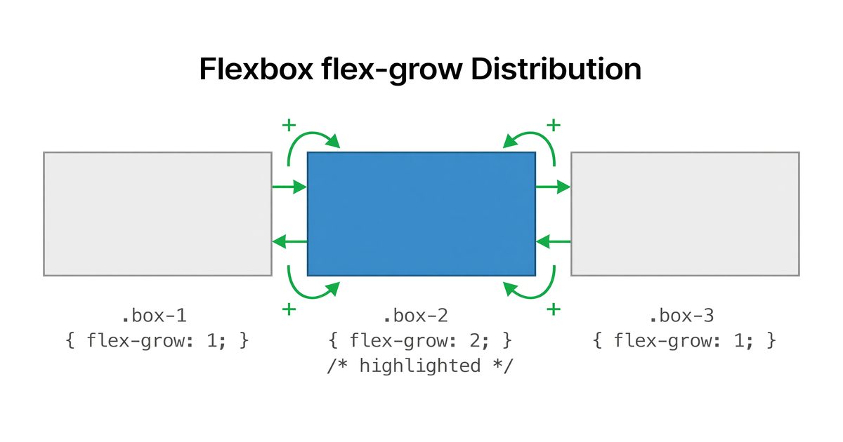
flex-grow is a ratio, not a size. It specifies what proportion of available positive free space an item receives relative to other flex items in the same container.
.item-a { flex-grow: 1; }
.item-b { flex-grow: 2; }
.item-c { flex-grow: 1; }
Total grow factor: 1 + 2 + 1 = 4. With 300px of positive free space:
- Item A receives 1/4 × 300 = 75px
- Item B receives 2/4 × 300 = 150px
- Item C receives 1/4 × 300 = 75px
Each item’s final width = flex-basis + share of free space.
flex-grow: 0 (the default)
The initial value is 0, meaning the item does not grow. An item with flex-grow: 0 keeps its base size regardless of how much space is available. This is why flex items don’t stretch to fill containers by default.
flex-grow: 1 on all items
Setting flex-grow: 1 on every item distributes free space evenly. All items have the same grow factor (1), so each receives an equal share.
.nav-item {
  flex-grow: 1;  /* each item takes equal share of free space */
}
This does not make items equal width unless they also have equal flex-basis values. Items start from their base sizes and then grow equally — if one item has a larger flex-basis, it remains larger after growing.
To make items truly equal width: flex: 1 with flex-basis: 0 (which the flex: 1 shorthand sets by default in most browsers).
What flex-grow: 1 actually means via shorthand
flex: 1 expands to flex-grow: 1; flex-shrink: 1; flex-basis: 0%. The flex-basis: 0% is critical — it means all space is free space, and that free space is divided equally. Items end up the same size.
flex: auto expands to flex-grow: 1; flex-shrink: 1; flex-basis: auto. Here, each item starts from its content size, and only the remaining space is divided equally. Items have different sizes proportional to their content.
flex-shrink: Absorbing Negative Free Space
flex-shrink controls how items reduce in size when the container is smaller than the combined base sizes of its items (negative free space).
.item-a { flex-basis: 300px; flex-shrink: 1; }
.item-b { flex-basis: 300px; flex-shrink: 2; }
Container: 500px. Combined base: 600px. Negative free space: −100px.
Total shrink factor: 1 + 2 = 3. But flex-shrink calculation is weighted by the item’s base size — items with larger base sizes absorb more of the deficit proportionally.
Weighted shrink calculation:
Item A weight: 300 × 1 = 300
Item B weight: 300 × 2 = 600
Total weight: 900
Item A shrinks by: (300/900) × 100 = 33.3px → final width: 266.7px
Item B shrinks by: (600/900) × 100 = 66.7px → final width: 233.3px
The larger the product of flex-basis × flex-shrink, the more that item absorbs of the overflow.
flex-shrink: 0 — preventing shrink
Setting flex-shrink: 0 prevents an item from shrinking below its base size. This is common for sidebars, logos, or any element that should maintain its size regardless of container pressure.
.sidebar {
  flex-basis: 240px;
  flex-shrink: 0;  /* never smaller than 240px */
  flex-grow: 0;    /* also never larger */
}
Combined with flex-grow: 0, this creates a fixed-size item that participates in flexbox layout without changing size — a common pattern for fixed sidebars in flex-based page layouts.
The flex Shorthand
flex is the standard way to set all three properties together. When you use flex instead of setting properties individually, the browser fills in sensible defaults for properties you don’t specify.
| Shorthand | flex-grow | flex-shrink | flex-basis |
|---|---|---|---|
flex: initial | 0 | 1 | auto |
flex: auto | 1 | 1 | auto |
flex: none | 0 | 0 | auto |
flex: 1 | 1 | 1 | 0% |
flex: 2 | 2 | 1 | 0% |
flex: 0 1 200px | 0 | 1 | 200px |
flex: 1 0 200px | 1 | 0 | 200px |
The single-number shorthand (flex: 1, flex: 2) sets flex-basis to 0%, not auto. This is the behavior that makes equal-width distributions work. Setting flex-grow: 1 by itself, without using the shorthand, leaves flex-basis: auto — a different result.
Recommendation: always use the flex shorthand rather than setting properties individually. The shorthand’s handling of omitted values is designed for correct behavior.
Common Patterns
Equal-width columns
.columns {
  display: flex;
}

.column {
  flex: 1;  /* grow: 1, shrink: 1, basis: 0% → equal width */
}
Fixed sidebar, flexible main
.layout {
  display: flex;
}

.sidebar {
  flex: 0 0 240px;  /* grow: 0, shrink: 0, basis: 240px — never changes */
}

.main {
  flex: 1;          /* takes all remaining space */
}
Content-sized items that fill remaining space
.toolbar {
  display: flex;
}

.toolbar-label {
  flex: none;  /* sized to content, no grow or shrink */
}

.toolbar-spacer {
  flex: 1;     /* absorbs all remaining space */
}

.toolbar-action {
  flex: none;
}
The spacer item (flex: 1) pushes action buttons to the right edge without using margin: auto or absolute positioning.
Proportional sizing from zero
.split {
  display: flex;
}

.split-primary {
  flex: 2;  /* takes 2/3 of total width */
}

.split-secondary {
  flex: 1;  /* takes 1/3 of total width */
}
Because flex: 2 and flex: 1 both use flex-basis: 0%, the entire container width is free space, divided in a 2:1 ratio.
Minimum Sizes and flex-shrink Limits
A flex item will not shrink below its minimum content size — the smallest size that still displays its content without overflow — even if flex-shrink and negative free space would mathematically require it. This minimum is determined by the min-width property (defaulting to auto for flex items, which resolves to the minimum content size).
If you explicitly set min-width: 0, you override this floor and allow the item to shrink until it reaches zero width or clips its content. This is sometimes needed when flex items contain long strings or code that would prevent shrinking:
.truncatable {
  flex: 1;
  min-width: 0;          /* allow shrinking past content minimum */
  overflow: hidden;
  text-overflow: ellipsis;
  white-space: nowrap;
}
Without min-width: 0, the text content prevents the item from shrinking, and the flex layout overflows its container.
flex-grow, flex-shrink, and flex-basis are one mechanism operating in three phases: establish base sizes, calculate available space, distribute it proportionally. Understanding which phase each property controls — and that flex-basis determines how much space is even available to distribute — resolves most flex sizing surprises. The flex shorthand is the correct way to set all three; use it rather than the individual properties to avoid the initialization behavior differences.


